Stef Posavec spoke to Roz Redd and Helen Ward
Roz and Helen:
Last year, Stef Posavec, a designer and writer whose work focuses on non-traditional representations of data, took up a residency with the data science stream of People Like You.
The practice of personalisation that suggests that “people like you like/buy/benefit from things like this”, requires large collections of data generated mainly through routine processes such as shopping or social media. In personalised medicine these data sets are generated through both routine healthcare and research, for example where collections of biological samples and health-related data are brought together in a “biobank” that is then available for future research. One example in the School of Public Health at Imperial College is the UK Airwave Health Monitoring Study, Airwave for short. This long-established study includes biological samples and health data on people who work for the police, and provides an example of how data and samples are collected, processed, stored and analysed. In trying to figure out what exactly is going on in biobanks more generally, Stef has been spending time with the Airwave study team. We asked her to share her reflections so far.
Stef:
For People Like You, I’m using my art practice to better understand how the various stakeholders in a biobank perceive the ‘people behind the numbers’ who consent to their biological samples and data being used and stored for research. To achieve this aim, I’m focusing on the participants and researchers of the UK Airwave Health Monitoring Study, a cohort study and biobank based at Imperial that’s been following the lives of 53,000 members of the police force since 2003. This research will inform the creation of a data-driven series of artworks aiming to communicate these insights to a wider audience.
My creative practice normally begins with extensive note-taking and research, after which I refine the work’s overarching concept (ideally very clever and very witty!) in writing, and only after this move onto thinking about how this will work in practice visually.
However, for my People Like You residency, the ‘problem’ of visualising the Airwave system wasn’t one that could be neatly solved through an hour or two writing in a notebook, as I felt overwhelmed by the sheer amount of information I’d gathered (and could keep gathering for eternity) and unable to progress in words alone. Feeling stuck, I decided to start drawing in the hope it would help me ‘see’ my research from a different perspective.
I began the process of mapping out the Airwave system through drawing it by hand, then going back to various parts of the drawn system and trying to illustrate, communicate, or visualise (or a mix of all three) what was happening in more detail through drawing, then re-drawing, and then drawing some more. It felt as though through this repetitive and laborious process I began to pull my bigger insights about how the Airwave biobank system worked from the paper, where with every small evolution of these drawings I was also one step closer to being able to explain and describe the various Airwave processes in words.
As mentioned, drawing isn’t normally how I start to think through a problem. But within this residency I’ve made the fortuitous discovery that drawing is a way for me to access the tacit, hard-to-articulate knowledge that I have gathered through weeks of research, interviews, and note-taking, where instead of communicating these insights in words in a notebook, instead I am able to communicate using colour, texture, form, and more.
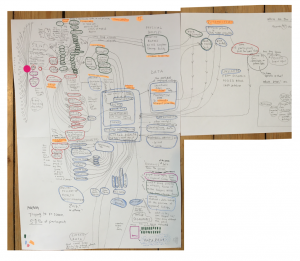
This hand-drawn diagram was the first step in my drawing process, where I began to roughly map out how data and samples taken from a study participant in a clinic would then be processed and stored for use in research.

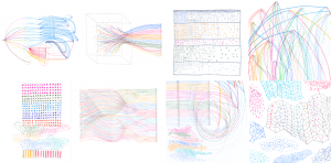
And these are a selection of the small drawings that I’ve been creating of all the different ‘angles’ of the Airwave system, in which I draw to understand different elements of my subject.

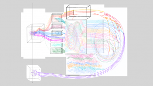
Next, using Keynote Presentation software, I begin to roughly patch these various drawn components into a complex whole to see how they work together. When I’m happy I’ll create a final artwork using these digital collages as a visual reference. Normally I work in Adobe design software but I’ve found that Keynote’s limited design capabilities keeps me focused on the bigger picture as opposed to the tiny details.

Normally when working with data and visualising it in some capacity for a creative project, I try to have the data in hand before I begin and aim to be accurate in my representation of this data as possible, however ‘artistic’ the end result will be. However, my People Like You residency has been different in that I am unable to access the actual data held within the Airwaves study for all of the usual data protection reasons. This has meant that I’ve had to come to understand this dataset and how it ‘flows’ from participant to researcher in a more roundabout way, and this drawn way of ‘figuring’ has helped me find ways of visualising inaccessible data that is inherently more ‘blurry’, but still provides rich information about the Airwaves process and its team member’s perceptions. Because of this, I suppose I now see the value in this blurrier type of data visualisation that captures the ‘spirit’ or ‘essence’ of the dataset through highlighting its connections, form, and flows even if it doesn’t represent the actual data to the number.
Roz and Helen:
Working with Stef and seeing her drawings has helped us explore how different actors – patients, researchers, clinicians, data scientists – interact with data. The sketches suggest ways that a person and their data travel, combine, separate and move almost like a murmuration of starlings; individual and group become inseparable, but scattered data points – remainders – also emerge that don’t quite fit in the boxes and groups. These are outliers, mis-codes, excluded or perhaps just waiting for other misfits. In “People Like You” we are exploring how figuration, figuring, and efforts to figure personalisation– “can help us think and study our increasingly datifed present”.
Drawing is helping Stef to see, or figure out, what is going on in Airwave; she is also helping us figure out what happens to the person in and out of the data.
19 January 2021