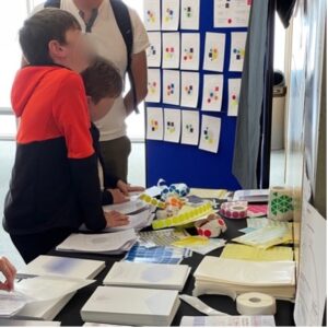
At the Great Exhibition Road Festival in June 2022, we asked visitors to our art exhibition, Data Murmurations, Points in Flight, to take part in a small game. They were asked, ‘which five datasets/points would paint the most accurate and complete picture of who you are as a person?’
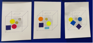
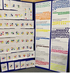
People were presented with 16 types of data and asked to pick just 5. Each type had a colour and shape code so that people could make a visual record of their response. Here are a few responses displayed on the board.
The game proved popular and appealed to children, adults, scientists, artists… all kinds of people. Over the two days of the exhibition, 114 cards were made with a total of 568 stickers (not everyone used all 5 choices). We added up the number of each type of sticker and displayed them to make a visual frequency, and a frequency chart of the whole distribution, grouping the categories into broad areas – health/biomedical, demographic, family history, social activities.
People spent a lot of time thinking and sometimes discussing which categories were important. This was a game, not a piece of research, and we didn’t ask for any information about people who participated, so we can’t say if there were any differences by age, for example. But it is still “data”. Not data about the people, but about what they, individually and as a population, chose as important types of data to describe them as a person.
 .
. 
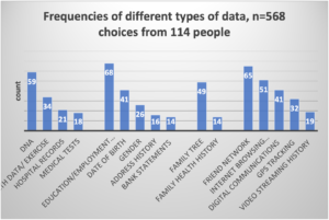
More than half of the people chose education/ employment history (dark blue square). More than half picked friend network (orange circle). And more than half picked DNA (blue circle). But only 19 picked all three. Other popular categories were internet browsing/searching history (gold circles) and family tree/genealogy (silver circles). Surprisingly (perhaps), fewer than one in five people chose gender (green circles), and just over a third chose date of birth (green triangles), which is interesting since these are the classic categories that researchers tend to start with when describing people and populations. We talked to several people about their choices after they had finished, and some said they had not picked basic demographic things as it didn’t say much about them as a person to know their age or gender, others thought that it could be worked out from other things they had selected like education/employment or internet browsing history. Some thought more abstractly about it: if you know a person’s age, you know so much about what they know about the world. Only 12% of people chose blue stars (bank statements). But one of those people said they wanted to pick it five times because it said everything about them since they didn’t have any money.
There were some clusters in the data. For example, those who chose education and employment history were less likely than others to pick video streaming history or medical history. For those who chose friend networks were less likely to include address history, gender, family health history, or medical tests. For those who chose DNA, browsing history, streaming history and gender were not common choices.
Using a method called multiple correspondence analysis to pick apart important variation in the kinds of data that people think are important, we found that those who pick family health background and medical tests (along with health tracking) tend not to think browsing history and digital communications nor movement tracking are important, and vice versa. 40% of the variation in choices falls along these divisions. Another significant variation is between those who pick gender or address history and DOB (the more traditional sociodemographic variables), which do not commonly co-occur with picking family tree, health tracking and DNA. This accounts for 10% of the variation in choices. (see chart)
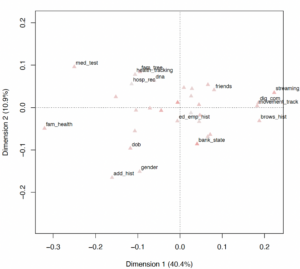
Chart showing results of the multiple correspondence analysis, with the x axis showing the dimension accounting for most variation with family health background and medical tests and health tracking on the left and browsing history, digital communications and movement tracking on the right. The y axis whose the other significant dimension with gender, address history and DOB on the lower part and family tree, health tracking and DNA higher up.
This was of course only a game. But isn’t it interesting how people have such variation in choices? In the People Like You project we have been looking at how the ways that people are grouped, using big data, are changing. Traditional groupings based on sociodemographic variables such as age, gender, social class, are no longer the only way to describe people like you. We are now likely to receive recommendations based on our activities, for example shopping, browsing history, travel, with the argument that ‘people like you buy/like things like this’.
From our little game, it seems that people have very different views about what kind of ‘would paint the most accurate and complete picture of who you are as a person’.